


Web Site Look & Feel: Graphic Design Rules for SAPweb Self Service
Background and Text Colors
The overall color scheme of all SAPweb Self Service pages is a light tan with dark text and buttons.
SAPwebss Header

Every screen (web page) in a SAPwebss application must contain the following information at the top of the screen.
- The name and location of the application (breadcrumbs) goes in the window title.
- The first page element is a teal green that names the SAPwebss application and location (same as the window title) on the left in white text. On the right goes today's date in blue text.
- The next row contains the user's name and help and home links. These are all formatted in a tan table row. The help link pops up a smaller help window (700 pixels tall by 500 pixels wide) and links directly to content specific help. The home link takes the user back to the specific gateway page they started at.
- The main page starts with the page title, which identifies the function of that particular screen.
System Messages
Messages appear below the page title, above any button. They appear in the following order:
 This
is a success message. This
is a success message. |
 This
is an error message. This
is an error message. |
| This is a note. |
 This
is a warning message.
This
is a warning message.Record Displays
Figure 1: A record display from SAPwebss.

When displaying a record, the field names are displayed as dark blue text on a light blue background.
Uneditable field values are displayed as unbold text on a different color than the page background.
Line Item Displays
Figure 2: A simple record set display from SAPwebss.
Note the inline radio button for each item. The Select All and
Deselect All buttons act on the radio buttons, or the user can
directly click each one.
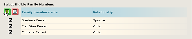
According to the information design rules, record sets displayed as a list of line items should be formatted to look like a spreadsheet. The following graphical rules apply:
- The table body has either a table border or a different background color than the page, not both.
- The table headers have a different background color than the table body and the page. The text is bold.
- The navigation controls for a multi-page list of line items are placed directly above the table, justified to the right edge of the table.
Buttons
Figure 3: A navigation button, a form button,
a record set button and both styles of inline buttons from SAPweb
Self Service.
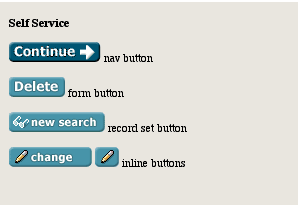
There are four different button styles, some of which have the same general look:
- Navigation and Wizard buttons use a different background color than all other buttons. They are placed on the right side of the page if they are wizard controls, and on the left side, above the form buttons, if they are any other kind of navigation.
- Form buttons look similar to navigation buttons typographically, but they don't contain arrows or other icons and have a lighter background color. Form buttons begin with an uppercase letter.
- Record Set buttons use all lowercase letters and the same background color as Form buttons.
- Inline buttons always contain an icon, and can contain text. If they have text, it is all lowercase, a verb, and shorter than 4 1/2 ems in length. All inline buttons are one of two widths in SAPwebss, so that they will look good stacked on top of each other. Other than these rules, they look the same as Record Set buttons.
The following Icons are allowed as inline buttons. They may be used with or without text:
View button
Click the View button to see details about a record but not to make changes to the record.
Change button
Click the Change button to change information in a record.
Undo button
Click the Undo button to undo changes that have been made to a record.
Search button
Click the Search button to execute a search for a valid field value.
Select All button
Click the Select All button to select all records listed.
Deselect All button
Click the Deselect All button to deselect all records that are currently selected.
Hyperlinks
Hyperlinks are always underlined. Nothing else is ever underlined.
If a hyperlink is inline with body text, it is the same font and font size as the rest of the text. You can have different styles for hyperlinks that have a unique purpose (like the glossary entries in this document).
Footer
The bottom of every page contains the MIT logo and MIT copyright below a horizontal rule. It is also acceptable to include the sponsor's logos, such as HR or CAO. All footer elements should be small and unobtrusive.
